Analysis of Swelling (Sw)
Los graficos interactivos tardan mucho en cargar!
Key Findings and Interpretation
The analysis reveals a statistically significant and improved relationship between the formulation components and the swelling (Sw). The final regression model is highly robust, explaining 82.58% of the variability in the data (R-sq), which indicates a very strong predictive capability. The analysis of variance (ANOVA) confirms the overall model is highly significant (P-Value = 0.000).
The most influential factors remain the interactions involving Calcium, specifically Water*Calcium (P=0.000) and Spiruline*Calcium (P=0.001), which have a significant negative effect on swelling. This confirms that higher Calcium concentrations reduce the material's swelling capacity. The interaction between Water*Spiruline (P=0.004) is also highly significant. The interaction between Alginate*NPs is included in the final model and is borderline significant (P=0.067), suggesting a complex interplay that is important for a complete model. The model is statistically sound, as confirmed by diagnostic plots which show normally distributed residuals without clear patterns.
Regression Equation
The relationship between the components and the swelling response is described by the following equation, where the process variable Calcium is coded (-1 for 1%, +1 for 5%):
Model Goodness-of-Fit
The statistical model provides an excellent fit to the experimental data. The key metrics from the "Model Summary" table indicate a highly reliable model:
- R-sq = 82.58%: The model explains over 82% of the variation in the swelling data, an improvement over the previous model.
- R-sq(adj) = 78.51%: The adjusted R-squared is high and close to the R-squared value, suggesting the model includes only significant terms.
- R-sq(pred) = 74.56%: The predicted R-squared demonstrates strong predictive power for new observations.
- S = 0.0583717: The standard error of the regression is low, indicating a small average distance between the observed values and the regression line.
The overall regression model is highly significant (P-Value = 0.000), confirming a true relationship between the predictors and the response.
Model Summary: Stepwise Selection
The following table shows the stepwise selection process for the final model. The last row, highlighted, represents the chosen model with the best combination of explanatory and predictive power.
| Step | S | R-sq (%) | R-sq(adj) (%) | R-sq(pred) (%) |
|---|---|---|---|---|
| 1 | 0.118893 | 18.08 | 10.85 | 0.00 |
| 2 | 0.0771666 | 66.51 | 62.45 | 55.04 |
| 3 | 0.0677224 | 74.98 | 71.08 | 65.54 |
| 4 | 0.0607749 | 80.48 | 76.71 | 72.06 |
| 5 | 0.0583717 | 82.58 | 78.51 | 74.56 |
Model Diagnostic Plots
To ensure the validity of the statistical model, a series of diagnostic plots were generated. These plots help confirm that the assumptions of the regression analysis are met. Below is a guide to interpreting each plot:
- Normal Probability Plot: This plot checks if the residuals are normally distributed. For a perfect normal distribution, the data points would align perfectly along a straight diagonal line. The goal is to see our experimental points fall closely to this theoretical line. Significant deviations may indicate that the assumption of normality is not met.
- Residuals vs Fits: This plot is used to detect non-constant variance, missing terms, or outliers. The points should be randomly scattered around the horizontal line at zero. Any clear pattern, such as a curve or a funnel shape, would suggest a problem with the model.
- Histogram of Residuals: This provides another visual check for the normality of residuals. The distribution should be roughly symmetric and bell-shaped, centered around zero.
- Residuals vs Order: This plot helps to verify that the residuals are independent of one another. The data points should show no discernible trend or pattern. Any systematic pattern could suggest that the order of the experiments influenced the results.
Pareto Chart of Effects
The Pareto chart visually ranks the importance of each factor and interaction on the swelling response. The red line indicates the threshold for statistical significance (α=0.05). Effects that cross this line are considered the most influential. The interactions with Calcium are clearly the most significant drivers of the process.
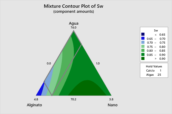
2D Contour Plots
The following interactive 2D contour plots show how pairs of variables influence swelling while holding the other factors at constant levels. These maps are essential for identifying optimal regions in the formulation space.
3D Surface Plots
These interactive 3D plots provide an intuitive view of the response surface. Each colored surface represents the predicted swelling response based on the model for a specific combination of held factors.
Overlaid on the surfaces are the data points from the actual experiments. The solid dots (●) represent the actual, measured swelling values, while the crosses (+) show the values predicted by the model for those same experimental conditions. The vertical distance between a dot and its corresponding cross represents the residual error for that point. A good model will have these points lying close to the surface, indicating small errors.